
Hey all!
After last week’s challenge of drawing a movie scene, we moved onto a more traditional-based theme. This week the challenge was to pick an artist we are inspired by, and to imitate their style while creating our own original piece of work.
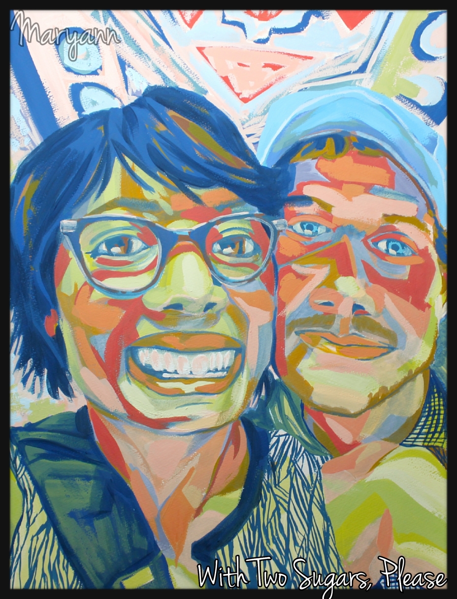
Materials: poster paint (the really sh*tty kind)
For this week’s theme, the artist whom I decided to emulate is Dana Schutz. Schutz is a contemporary American artist based in New York. Her oil paintings are highly narrative and typically really funny, with either quirky, gross or somewhat twisted subjects and themes. Her colors are bright and youthful, and her brushstrokes are active and gestural. As much as I love her work, I don’t think my work could be more different, and that’s why I chose her.
This week I painted from a pre-existing photograph of myself and my husband. I looked at a lot of Schutz’s work and tried my best to derive my color palette from hers. My biggest problems really arose from not having access to good oil paints. Being stuck with quick-drying, chalky poster paints in only red, white, yellow, blue and black made mixing her incredibly vibrant colors pretty much impossible. Although I tried really hard at the beginning to be true to her essence, as time went on I found myself straying further and further away from her style unintentionally. In the end, I think my painting was a little sloppy and unfocused, but really challenged my abilities both in terms of materials and color composition. And it was really fun! Overall, I am satisfied with my outcome too. But I have really got to get my hands on some good paint…

Materials: ProMarkers, Water colour, washi tape
For this week’s challenge I decided to choose one of my favourite Japanese artists from the SuperFlat movement. Chiho Aoshima’s work has inspired me for a long time, as when I was in college my teachers were reluctant to accept “manga” influenced work as a legitimate form of fine art. I was thrilled to discover the SuperFlat movement which explored pop-culture and modern art styles – while exploring post-war Japanese culture.
Chiho Aoshima stood out to me for her use of female figure, bright and flat colour palettes and incredible detail. She predominantly works using vector based computer software.. quite the opposite of me as you can tell. I decided to focus on her use of colour, pattern and unusual imagery. Colour palettes are extremely hard for me to work with as I get so caught up in thinking about what would look good – especially with such bold ones! I hope that this is as bold and enticing as her vision – I wouldn’t have said it strayed too far from my comfort zone though, so perhaps next time I need to get the PC fired up and work on there!
